Get inspired...
- Details
- DECORATION DECORATION
- ➤ INSPIRATION INSPIRATION
- Published: 06 January 2016 06 January 2016
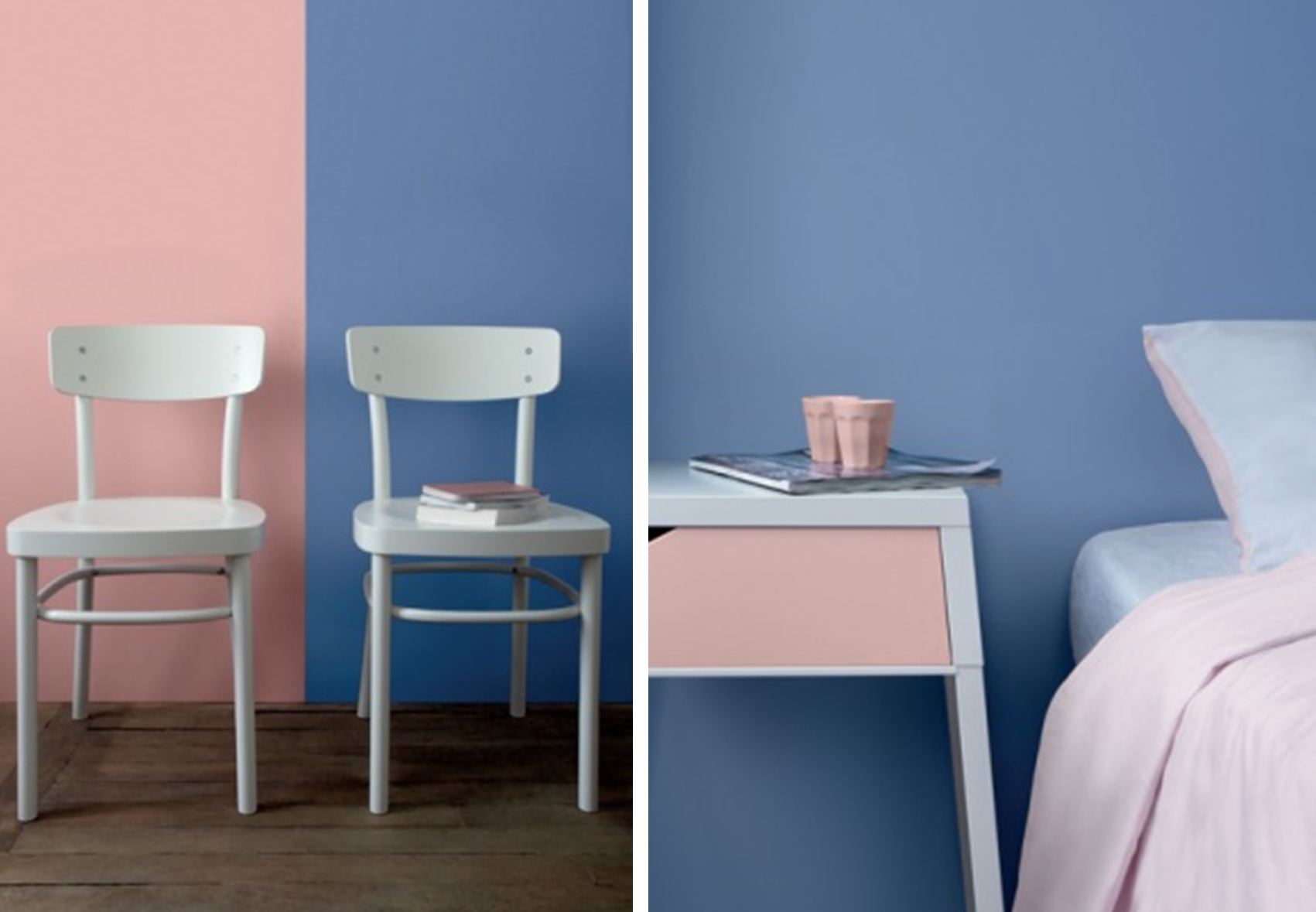
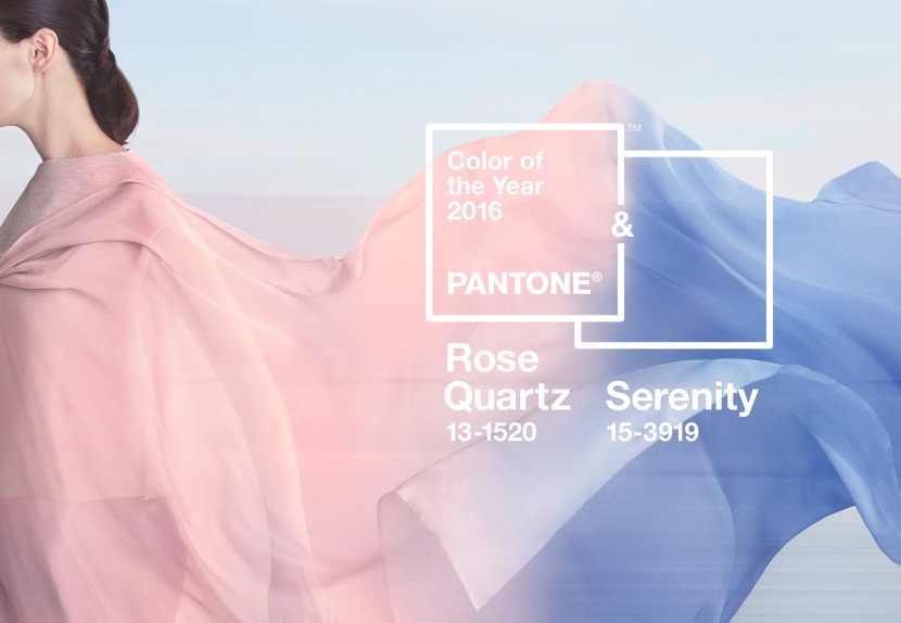
For the past 15 years Pantone, the famous authority on color, comes out with a yearly it color that should inspire fashion, beauty and decoration. For the first time, two colors will be showcased in 2016: Rose Quartz and Serenity Blue. Following Marsala, these pastel colors will join the “Inspired by Pantone” collection of paints by Tollens.
 © Pantone
Signifying Inner Peace
Rose Quartz is a pastel pink both elegant and delicate, whereas Serenity is a lavender blue both creamy and refined. Their union “demonstrate[s] an inherent balance between a warmer embracing rose tone and the cooler tranquil blue, reflecting connection and wellness as well as a soothing sense of order and peace,” Leatrice Eiseman, Executive Director of Pantone Color Institute explains.
Welcoming and Peaceful Décor
Going just as well together as they do alone, these 2016 colors inspire lightness and softness: they give you a sense of security. Used in décor, they’ll transform you interior into a peace sanctuary, a genuine stress antidote to our modern lifestyles. You’ll thus be able to relax and welcome Airbnb & co guests into the comforting and relaxing atmosphere of your home.
How to Use Them Together?
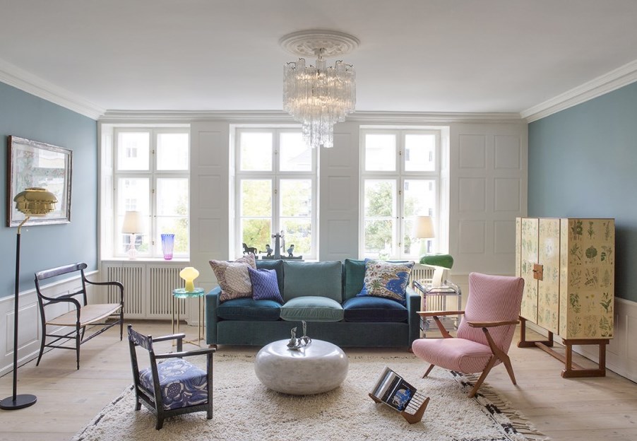
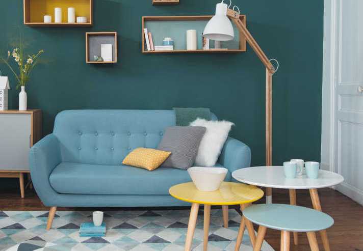
- Rose Quartz and Serenity go well with a plethora of medium intensity hues, like purples and greens, rich browns and yellow shades.
- Choose one of the two colors as the dominant shade and the other in little touches. For example, you can use one color to paint the walls (one wall, two maximum) and the other for the sofa, the rug, the cushions or even the curtains. In a bedroom, feel free to mix and match on the bed sheets, making the comforter pink and the pillows blue.
- Rustic and natural materials pair wonderfully with these colors. Light wood furniture warms up the atmosphere, and so does wicker.
- Leather, gold or brass accessories are also welcome. Fixtures, stools, low coffee tables…
- Add in a touch of graphics or solid colors to give your place some character.
How to Use Blue Serenity Alone?
- Serenity wall paint paired with white furniture in a living room will give your space a very Nordic look. The splash of white will add some intensity, but if this combo doesn’t seem warm enough, add colorful decorative accessories. Oranges, yellows, browns and greens naturally revitalize this blue, giving it an eccentric look.
- Serenity adds a fresh nuance to the bedroom when coupled with greys, stronger blues (pigeon blue, for example) and violets.
- Combined with black, Serenity will make your space look modern and elegant.
How to Use Rose Quartz Alone?
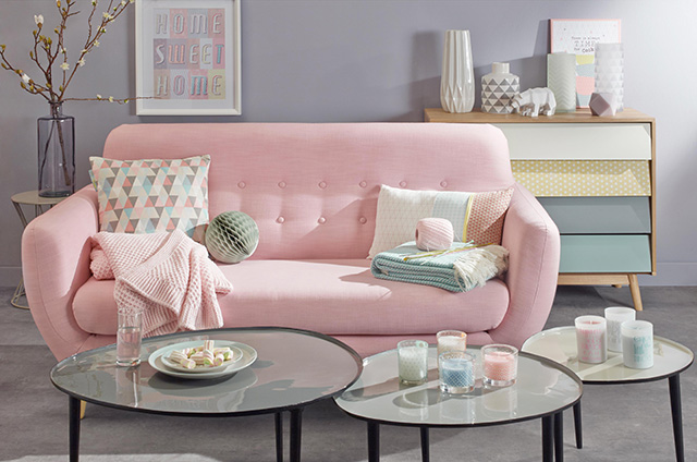
- Rose Quartz goes well in a modern living room when paired with neutral and natural tones. Oak grey fits it like a glove. Add mint or pine green accessories.
- Combined with black, Rose Quartz evokes contemporary industrial style on the one hand and boudoir chic on the other.
- By pairing it with the famous Radiant Orchid (color of the year 2014), you’ll create a vintage pop atmosphere.
- Combined with metal, Rose Quartz livens up and radiates elegance.
Basically, these two colors go together perfectly but also do incredibly well in all sorts of settings. They span styles, from contemporary to vintage, by way of industrial and romantic chic.
