Get inspired...
- Details
- DECORATION DECORATION
- ➤ INSPIRATION INSPIRATION
- Published: 18 March 2016 18 March 2016
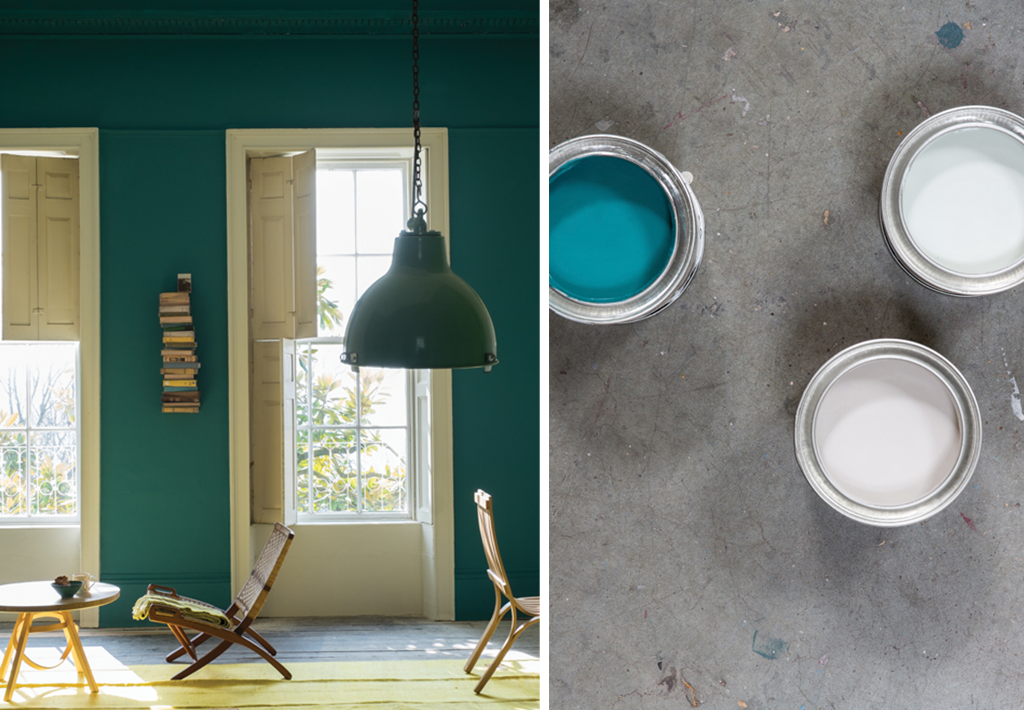
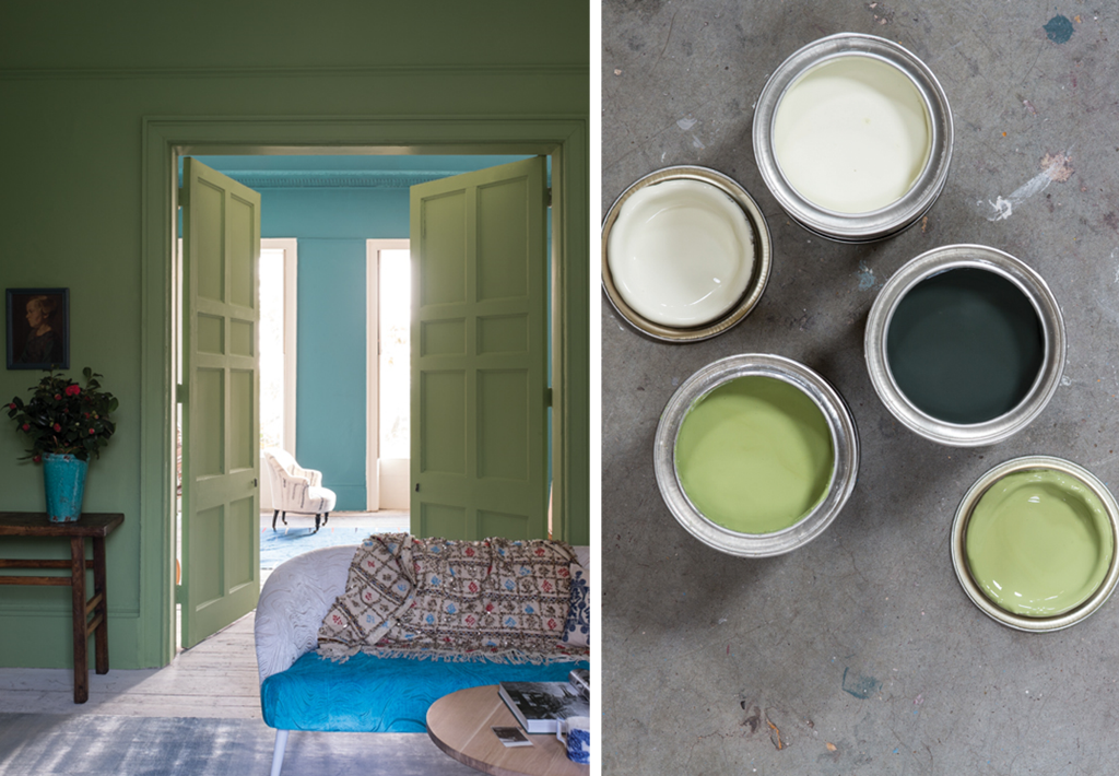
For their 70th anniversary, paint and wallpaper craftsmen Farrow & Ball are adding 9 colors to their palette. Their connection to nature continues with these new hues, on the one hand neutral and ever so soft, on the other bright and bold. Made in Dorset county on the English Channel coast, every color has its own history and is written into this color expert’s DNA, giving us warm and timeless décor options. We’re showcasing three of these colors that will imbue both modern and traditional interiors with the spirit of spring.
Vardo
Inspired by bohemian trolleys, Vardo is an incredibly vibrant color that remains versatile. This teal blue goes particularly well with whites, but also looks good alongside red and dark greys. Used in rooms with Western exposure, Vardo will intensify in color throughout the day, becoming beautifully radiant at dusk.
Yearbridge Green
This fresh green was discovered in a 17th century Georgian farm at Yearbridge House. Similar in color to an avocado with slight yellow tones, this color will make your interior look joyful and refreshing. In a room with Northern exposure it’ll take on more earthy green tones.
Peignoir
Drawing inspiration from the silk robes worn in the mid 10th century by high-society ladies in boudoirs, Peignoir was created by adding a pinch of grey to the softness of pink. This combination has the ability to evoke both tradition and modernity. It adds a feminine, warm and romantic feel to period homes and pairs beautifully with the neutral tones of contemporary interiors.
Have you been swayed by the elegance of these hues for your rental?


