Get inspired...
- Details
- DECORATION DECORATION
- ➤ INSPIRATION INSPIRATION
- Published: 29 August 2016 29 August 2016
Ultra-trendy at the moment, prints can be an elegant addition to your walls, sofas, cushions, carpets, curtains, dishware... They quickly adorn any interior and allow for full customization of your rental. Admittedly though, it’s not always so easy to combine all these colourful or black & white patterns, geometric or ethnic ones, animal or floral, dotted or checkered. There is always the risk of accumulating too many and falling into a faux-pas. To create a harmonious and welcoming décor, it’s important to mix these different prints with care and selectivity, it really is an art in itself. Here are the basics for taking those first steps with ease...
A few tips before starting
- Prints are usually a love-at-first-site affair and it can be tempting to fill your house with the design. Remember though, your property is for rent and as such, its best to use any given motif sparingly so as not to overwhelm a room and potentially put-off your guests, whose tastes may differ from your own.
- In interior-decoration as in fashion, it’s recommended not to mix more than three colours and/or 5 motifs
- To avoid overload, only dress one façade with the motif rather than every wall in the room.
- Avoid the ‘complete’ look. A combination that works wonderfully for example, is a printed sofa with solid coloured cushions, or, printed cushions with a solid coloured sofa.
- Small motifs are put in the spotlight when used on smaller accessories. On the other hand, large motifs adapt as well to accessories as they do to furniture of all sizes.
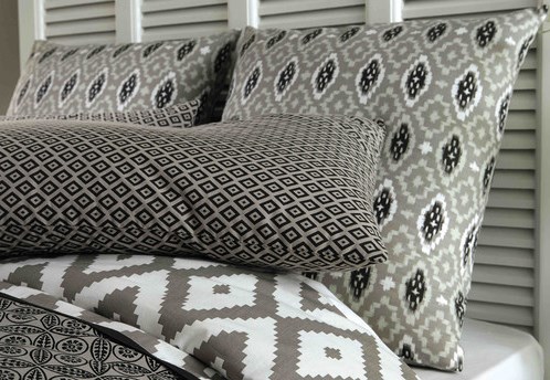
- Stripes and diamond patterns combine well with all types of print so they are easy to use. The only thing to beware of is making sure the colours match well.
- Black and white graphics are fashionable at the moment and combine beautifully with brightly coloured accessories.
How to easily mix prints?
By colour
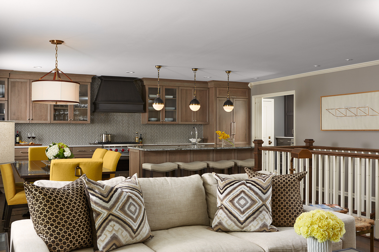
You can mix several motifs by using colour as the common denominator in various patterns. Below are several examples to inspire you, using green, pink, blue, yellow, grey or brown.
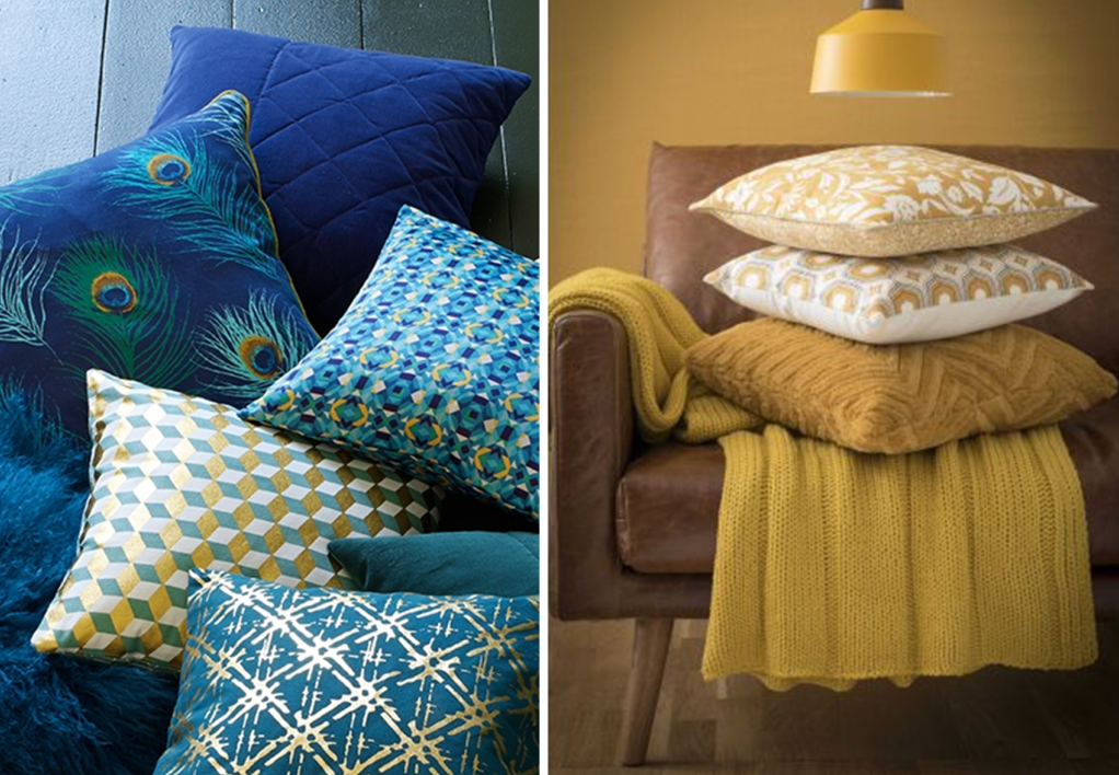 Left : La Redoute Intérieurs / Right : Maisons du monde
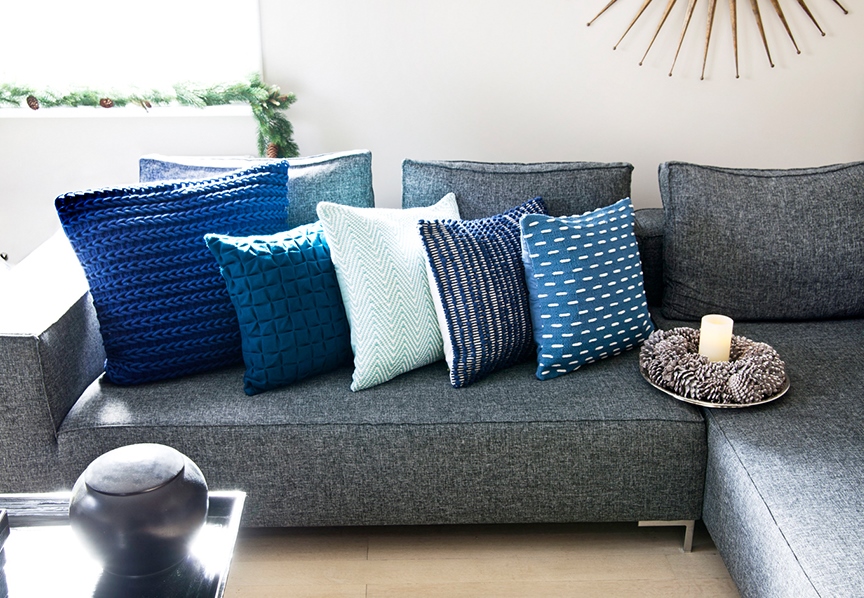
Bear in mind that it’s also possible to use patterns in different shades of the same colour; that is to say in a gradient of one colour. In the example below, there is cobalt blue, denim, navy, peacock and turquoise.
By shade
For those wishing to go further into colour associations, prints can be complementary when used in a specific shade of three to five colours, this means that the colours are different but they have the same value; that is the same degree of lightness or darkness.
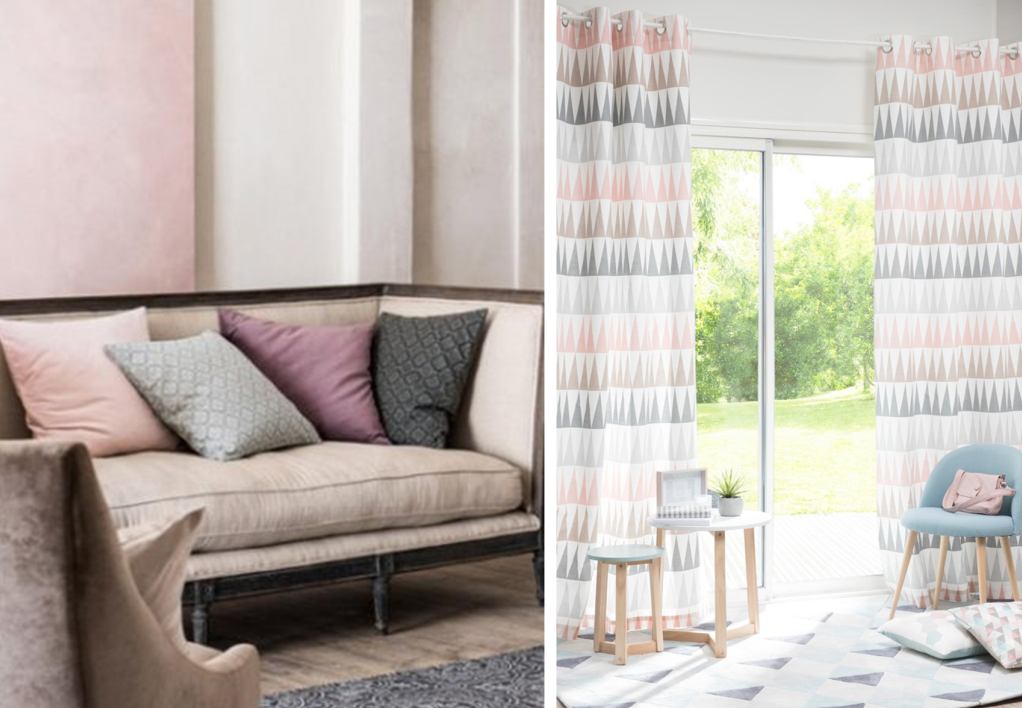 Left : H&M Home / Right : Maisons du monde
By motif
For novices, the combinations of prints based on motifs are risk-free. To do this, simply choose one motif or pattern that you use in different colours throughout the room.
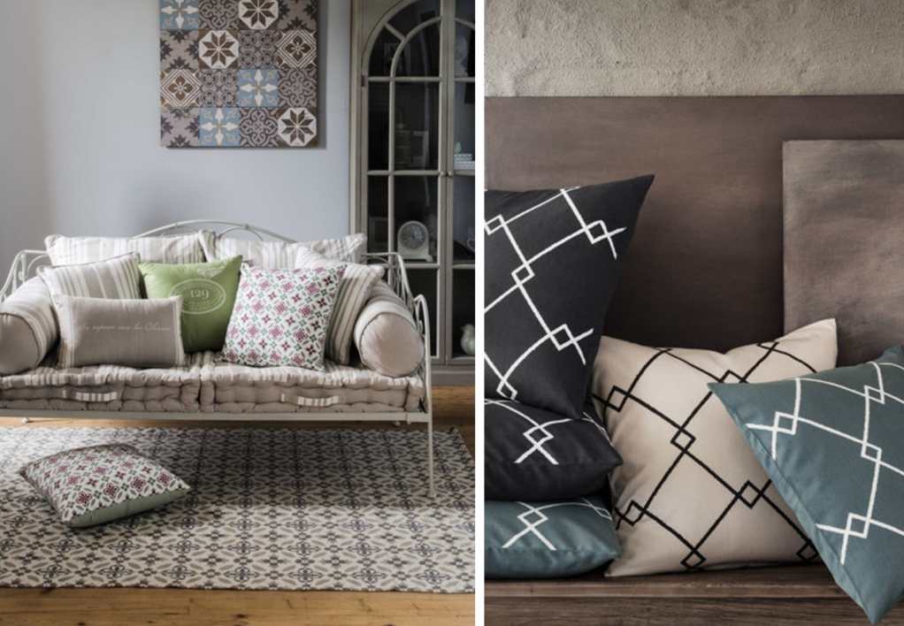 Left : Maisons du monde / Right : H&M Home
By style
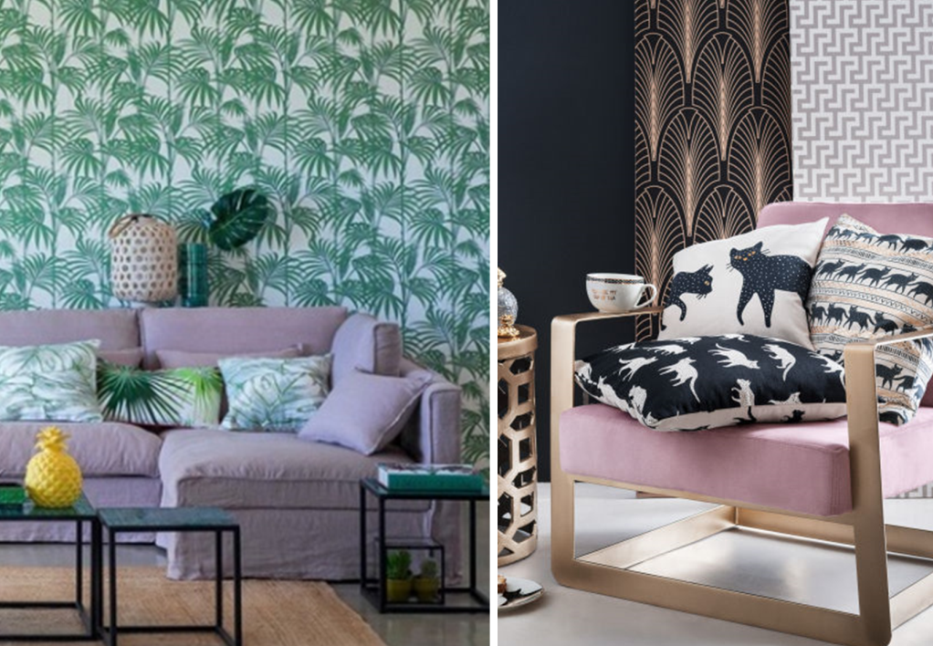
Another way forward is to focus on a particular style or spirit. You can therefore mix prints that are different, but belong to the same family. For example, you can combine floral patterns or stripes, plaid, animal prints, etc. Below: flowers, palm trees and cats are used as the common theme of the room.
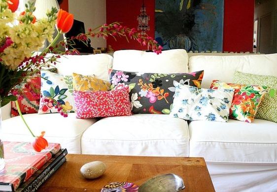 Tamar Schechner de Nest Pretty Things Inc
By size
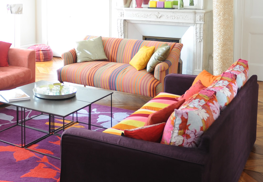
Another method is to play on size. That is to say, combining prints of varying scales. This allows to create a sense of perspective within a room as well as liven it up. You can use multiple motifs, however, it is advisable to choose neutral colours or black and white to create harmony and avoid creating an anxiety-provoking room. In this first example, the choice of bright colours is bold indeed, but the combination passes thanks to a large floral carpet and pinstripes on the sofas.
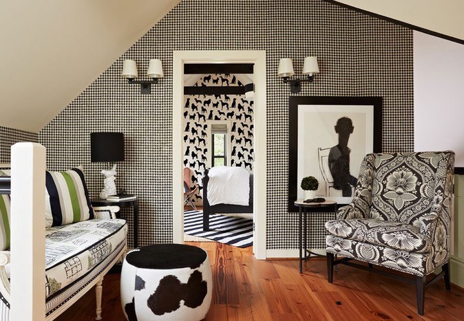
In this new example, the combination of the hound’s-tooth print, cow, animal, cashmere, plaid, and stripes gives depth to the room.
You now have the foundations to become a print master! You’ll see, use them well and they will bring an undeniable style to your rental space. Today’s motto: be daring!

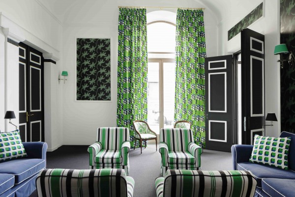
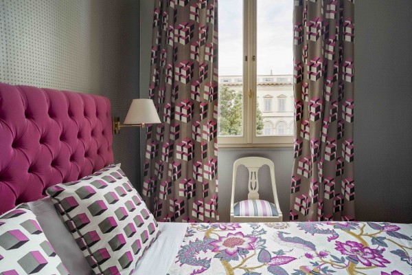
 Westwing
 Left:
Left: 